
CONTEXT
MY ROLE
Product Designer
TIMELINE
Jan 2026 - Feb 2026
TEAM
Me!
SKILLS/TOOLS
Design Systems
User Research
Competitive Analysis
Prototyping
Visual Branding
OVERVIEW
Bookworm is a social reading app that lets readers log books and share memorable reactions as part of an ongoing cultural conversation. Instead of long-form reviews or rigid rating metrics, it emphasizes short responses, humorous quips, and personal connections that reflect how books actually live in readers’ lives.
In my daily life, instead of only finding long, in-depth analyses of the books I read, I wanted something that could be taken less seriously with less stakes, and I came to find that many of my friends felt the same way. That idea became the foundation for Bookworm so that we could have fun following finishing a book. While this was a design sprint that I finished within ~two weeks, I plan on developing the platform even further with hopes of launching the app on the app store!
THE PROBLEM
Readers lack a simple way to publicly react to books in the same spontaneous, expressive way they react to other forms of media.
While readers often have immediate, emotional reactions to books (like amusement, frustration, admiration, or even surprise), there is no simple, public way to express those reactions in the moment. Existing platforms favor structured reviews or private notes, which makes spontaneous, expressive responses feel out of place or unnecessary. As a result, much of the conversation around books happens elsewhere, disconnected from the act of reading itself.
SOLUTION
Bookworm: Read it. React to it. Share it.
The mobile platform draws inspiration from Letterboxd’s model, reimagined for readers. Its goal is to help users track what they’re reading without turning the experience into productivity or performance, and instead create a space where books spark conversation rather than becoming another checklist. On Bookworm, readers can share real-time reactions and engage with others through a dynamic feed that surfaces new titles organically. The platform also centers around curating your personal bookshelf, featuring a “top shelf” of your top four favorite books of all time and customizable recent activity, complete with plants and decor unlocked as you read more.
COMPETITIVE ANALYSIS
Looking at what's already built to figure out what's still missing.
The platforms that exist today each do something well, whether it's their library comprehensiveness, data depth, or ability to form book clubs, but none have successfully threaded the needle between simplifying the process of a platform that is lighthearted in nature, appealing to both casual and daily readers. Moving forward, my goal wasn’t to reinvent the process of book tracking from scratch, but to reimagine it as a space that feels more like Letterboxd or Instagram than a productivity tool.
Current Apps on the Market

GOODREADS
→ Database first, community second platform

STORYGRAPH
→ Mostly a tracking and analytics tool

FABLE
→ Social media focused, book club centered
Gaps Identified
Opportunity Areas
Tracking is either too rigid or too minimal
Create a feed-driven experience where spontaneous reactions and organic discovery feel native, not bolted on. Reading becomes inherently social without requiring commitment to structured book clubs.
Social engagement feels like a feature, not the foundation
Build lightweight progress tracking that rewards engagement without creating pressure, feeling like you are only checking off a task.
UI/UX hasn't evolved for mobile-first Gen Z users
Build a mobile experience that feels native to how Gen Z already uses apps; being quick to scan, and visually engaging.
USER INTERVIEWS
Investigating why Letterboxd clicks for movies but book apps still miss the mark.
I sat down with 10 people who fall into three main camps: the kind who read constantly and actually care about remembering what they've read, the kind that is more of a casual reader that are just looking for a more fun way to interact with other people who read the same book, and the kind who log every movie they watch on Letterboxd like it's second nature. The point wasn't just to ask what they do, but dig into the why behind it, and find the gaps where apps aren't quite hitting the mark.
What I asked:
How do you currently keep track of the books you read, if at all?
What usually motivates you to log or remember a book after you finish it?
Are there moments during or after reading when you wish you could record a thought but don’t? What do you do instead?
Which platforms or tools have you used to track or talk about books in the past? What worked and what didn’t?
How does the way you talk about movies online differ from how you talk about books? Why do you think that is?
Key Insights
⚖️
Readers want to capture reactions, but current tools make it feel like work, indicating a gap for lightweight, expressive capture that fits naturally into reading behavior.
🔍
People don’t talk less about books because they have less to say, they talk less because the cost of saying something feels higher, since reading is often framed as an intellectual performance, not a casual reflection.
How might we help readers discover books and build community through authentic, lightweight reactions?
OPPORTUNITY
ITERATIONS & USER TESTING
Building the blueprint and mapping out how the app should actually work.
Based on what I heard in interviews and saw missing in competitors, I started sketching out the bones of the app: what features mattered most, how they'd connect, and where the experience should feel frictionless versus intentional. Beginning with a more broad overview, I started out this synthesis process of my findings by creating an information architecture.
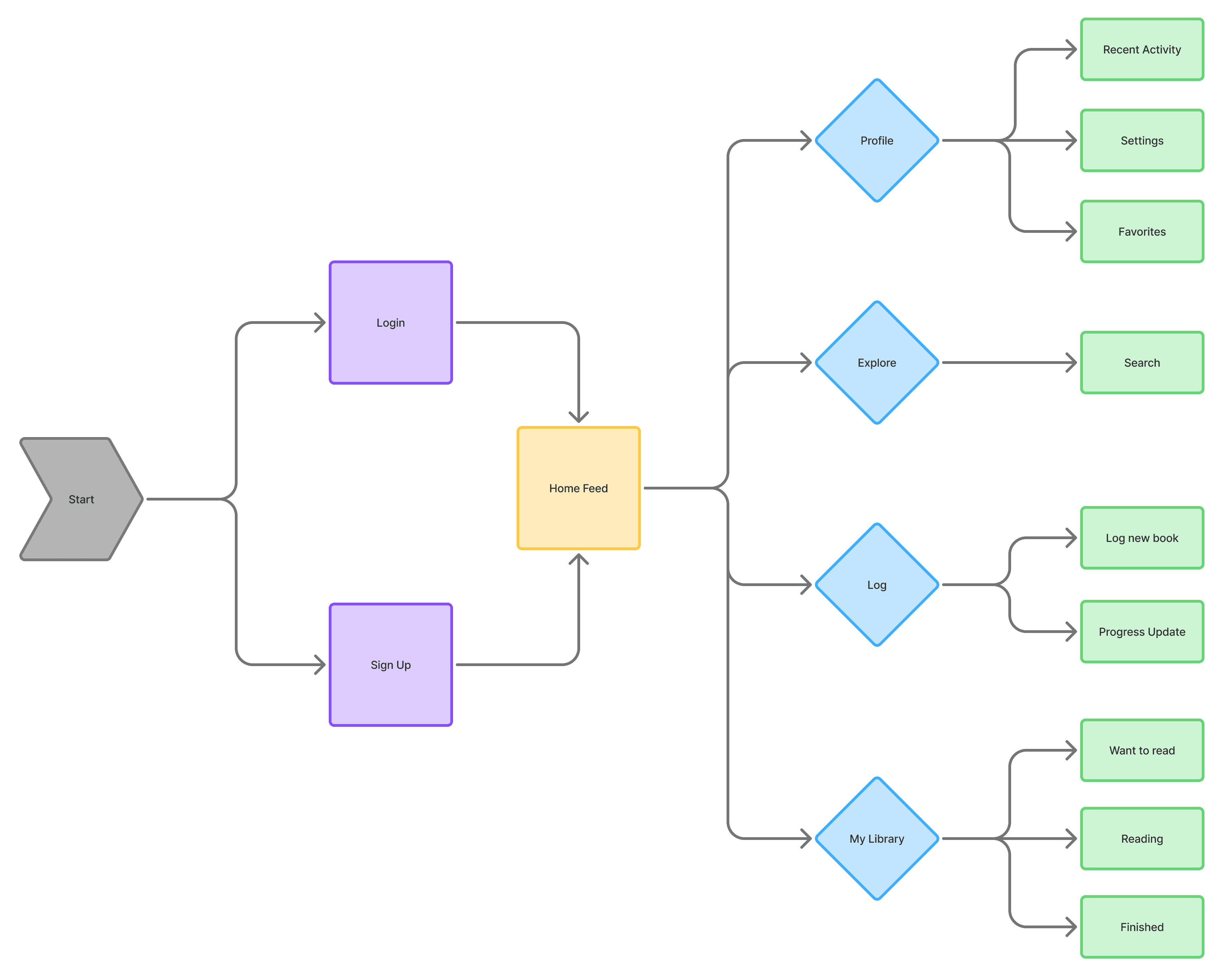
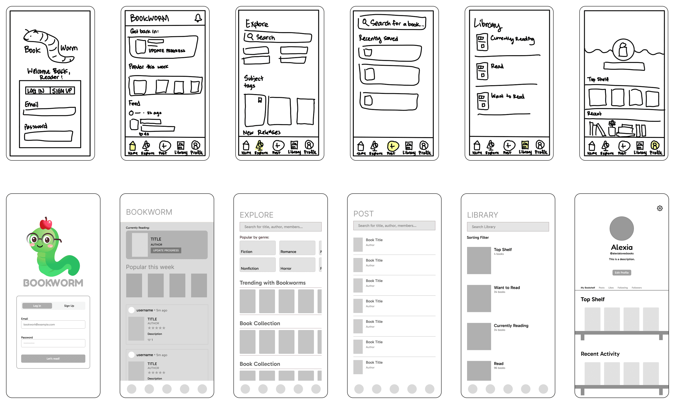
In order to get a clearer idea of HOW I would incorporate this feature-wise into the app, I sketched out low-fidelity wireframes that visualized the different screens I laid out in the information architecture. I wanted to focus on keeping the layouts familiar based on existing reading apps, while incorporating more elements of fun and personalization. The core features would be a Home page with a scrollable feed, an Explore Page that incorporates interesting reading lists, a Library Page, and a Profile that other Bookworms can visit.
ITERATIONS
3 Major Improvements!
After building out my medium-fidelity prototypes, I put them in front of users to see what actually worked and what didn't. Their feedback surfaced some friction points I hadn't noticed and confirmed which features could be revamped. I took those insights back into the design and made three major changes that reshaped the core experience.
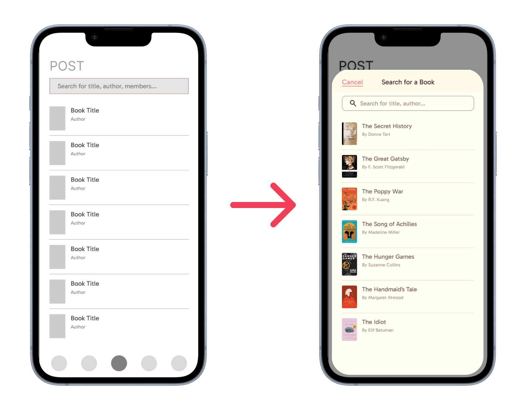
Making posting feel instant, not like a detour
My early versions treated posting as its own dedicated screen, a page that you'd have to navigate away to from wherever you were just to share a reaction. That felt clunky. I redesigned it as a pop-up modal accessible from anywhere in the app, so logging a book or dropping a thought could happen in the moment without breaking your flow.
Rethinking the profile, the heart of the app
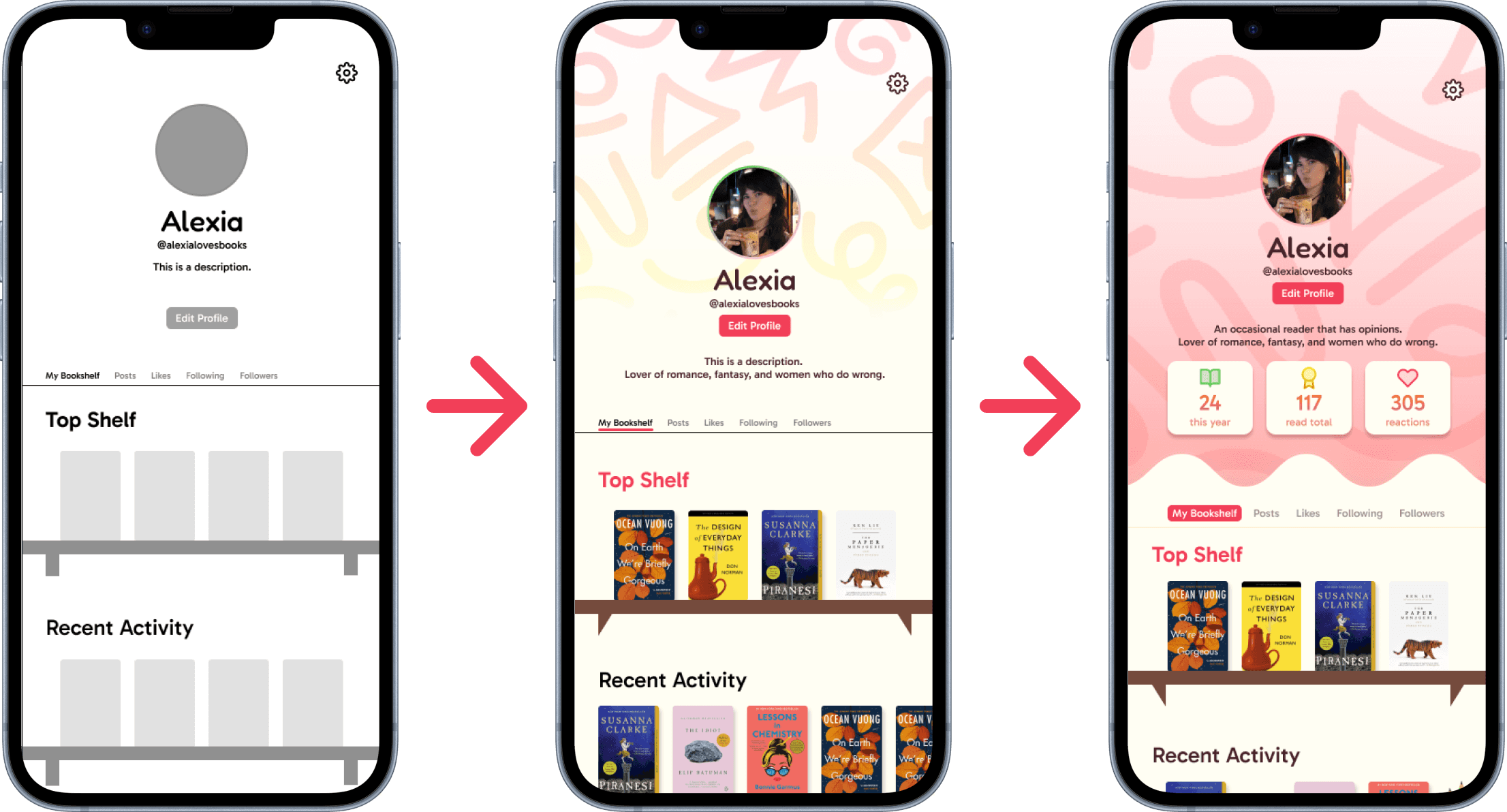
The profile went through the most changes because it's arguably the most important part of the experience. I experimented with different ways to visually showcase your bookshelf, your top four, and your recent activity. The goal was to make it feel less like a static list and more like a space you'd actually want to show off.
username ◦ 5m ago
TITLE
AUTHOR
Description
1
username ◦ 5m ago
Title
Author Name ◦ 2020
Early Pages🌱 · 20%
This is a dynamic description commenting on someone’s thought for a book!
1
Adding reading progress with context, not just percentages
Initially, tracking progress was pretty bare-bones. I refined the flow to include richer indicators, like whether you're in the early pages, midway through, or nearing the end, so other readers could see where you are and relate to your experience in real time. It made progress feel more conversational and less transactional.
FINAL DESIGN SYSTEM

THE FINAL DESIGN
Become a Bookworm.


REFLECTIONS
Wow. It’s over? Or is it🤔.....
As my first ever individual case study, I learned a lot! The goal for my month-long design sprint was not only just to create something that resonates with me, but also see what I can do on my own when not in a group setting. It’s safe to say that the process is very different because collaboration is something I am quite used to, but it taught me a lot about all aspects of the design process, from research all the way to prototyping different features.
I am now moving from the design process to the development process, hopefully recreating the design using Swift and launching it on the app store! Although this may have began as a project I started to get better at design thinking (which I can confidently say that whoever says practice makes perfect, they were right), it became something so much more. I’m grateful for all of the people who made this design possible, and I look forward to the future of Bookworm! :)
Thanks for stopping by :) ˖.𖥔 ݁ ˖ ⊹ ࣪ ˖
Curious to learn more? Let's grow together❀!

Back to top ↑